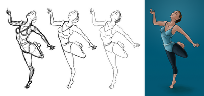
Here's the progress drawings I submitted to the actual thread.
I didn't use any reference for this, which usually results in crap. Granted, the proportions are a bit off in places, but for no reference I'm pretty satisfied with this. Also, this is the first drawing that I can say has more life the more I refined it. Most of the time, my sketches feel good, but once I clean it up, it sort of flattens out and dies a little.
A good example of that problem happening is with this fisherman I drew a while back:
Sketch
Final - Especially the eyes, they look a lot less alive in this version.
------------------------------------------------------------------------------------------------
And here's some sketches I did when I was trying to come up with a good figure to draw for the thread. The barbarian kinda guy is a bit wonky. I was going for cartoonish proportions but the end result wasn't too cartoony so it kinda ruins it. Wizard's pose was just a bit bland.


Ryan ~ I love the progression ... the final product is wonderful but the work behind the results is fascinating ... the perspective (curve of the body with the head and arms back) is also interesting ... very cool young man!! =)
ReplyDelete